Introduction
Setting the background color of an Android application plays a crucial role in mobile design. It enhances the visual appeal of your app while defining brand identity and semantic purpose. This guide covers various ways to set and manage background colors in Android, including best practices for accessibility, dynamic color changes, and customization options.
Understanding Color in Android Design
Color Roles in Android
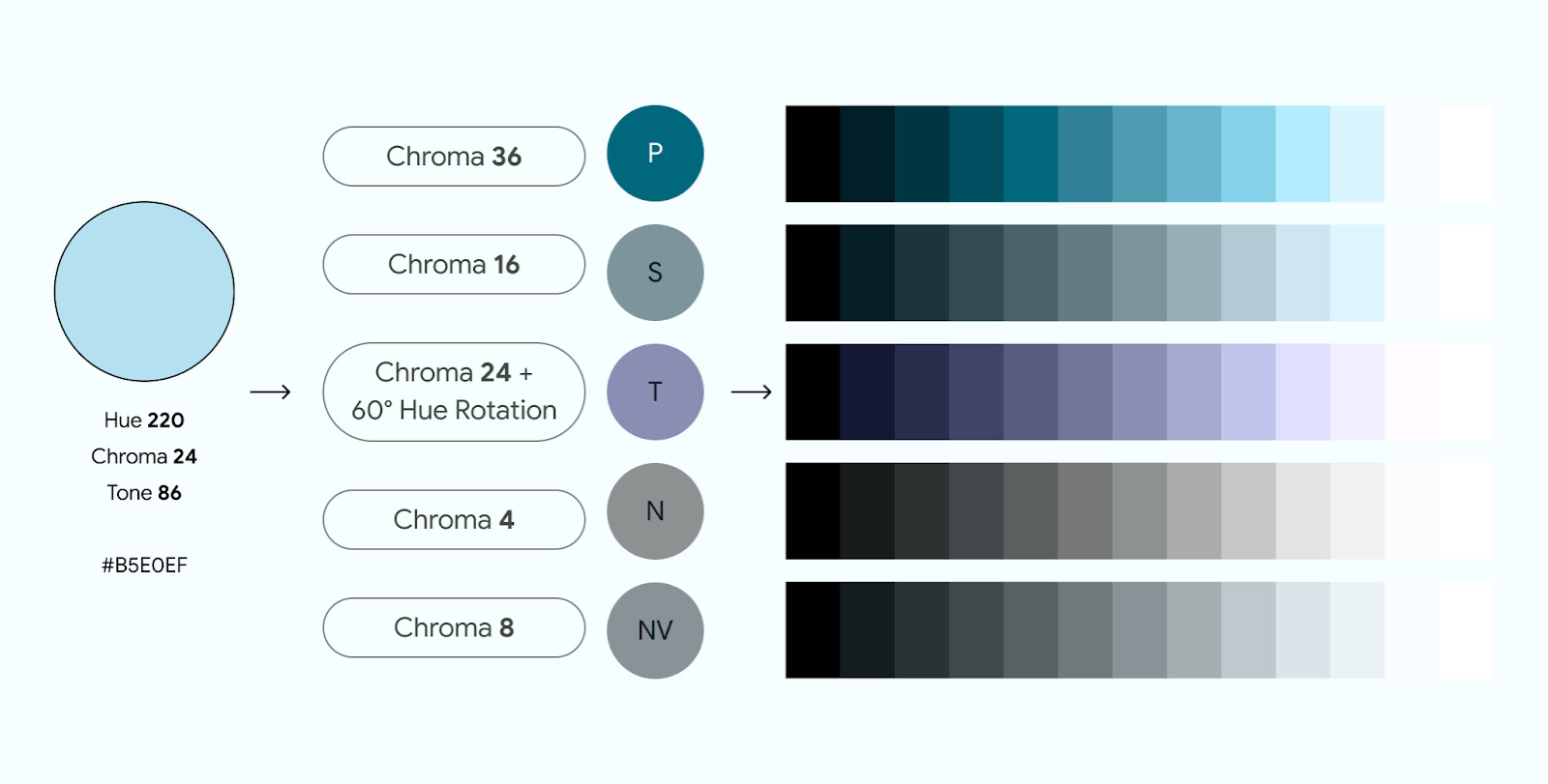
Android design emphasizes using colors to express style and communicate meaning. There are three primary roles for colors in an Android application:
- Accent Colors: Core colors typically part of the Android brand color palette. Accent colors draw attention to specific elements within the UI, such as buttons or icons.
- Semantic Colors: Custom colors with specific meanings within the Material Design 3 framework. Semantic colors help define the purpose of different UI elements, making the app more intuitive for users.
- Surface Colors: Neutral-derived colors used for background elements such as component containers, sheets, and panes. Surface colors represent the majority of your app's colors, providing a clean and organized visual space for content.
Accessibility and Color
When designing an Android application, consider accessibility. Some users may have color blindness or other visual impairments affecting how they perceive colors. To ensure accessibility:
- Check Color Contrast: Avoid pairing colors with similar tones, as this can make it difficult for users with color blindness to distinguish between elements. Use tools to check the color contrast ratio between foreground and background elements, aiming for a minimum of 4.5:1 for body text against all elevation surfaces.
- Avoid Common Patterns: While red and green are common patterns, they are not accessible to users with certain types of color blindness. Use desaturated colors or other alternatives meeting accessibility standards.
Setting Background Colors in Android
Using XML
One straightforward way to set a background color in Android is by using XML. Define colors in a colors.xml file and reference them in layout files.
Defining Colors in colors.xml
Add an entry to the colors.xml file in the res/values directory of your project. For example:
xml
Using Colors in Layout Files
Once colors are defined, use them in layout files by referencing them with the @color syntax. For instance:
xml
<!-- Other layout elements -->
Using Code
To set the background color programmatically, use the setBackgroundColor method of the View class. Here’s an example:
java
import android.os.Bundle;
import android.widget.TextView;
import android.view.View;
import android.graphics.Color;
public class MealActivity extends Activity {
@Override
public void onCreate(Bundle savedInstanceState) {
    super.onCreate(savedInstanceState);
    setContentView(R.layout.activity_meal);

    // Get the RelativeLayout by its ID.
    RelativeLayout mealLayout = (RelativeLayout) findViewById(R.id.mealLayout);

    // Set the background color.
    mealLayout.setBackgroundColor(Color.GREEN);
}
}
Dynamic Background Color Changes
Sometimes, changing the background color dynamically based on user interaction or other conditions is necessary. This can be achieved by using a combination of code and layout changes.
Example: Random Background Color
To create a dynamic background color that changes continuously, use a timer and generate random colors. Here’s an example:
java
import android.os.Bundle;
import android.widget.TextView;
import android.view.View;
import android.graphics.Color;
import java.util.Random;
import java.util.Timer;
import java.util.TimerTask;
public class MealActivity extends Activity {
private RelativeLayout mealLayout;

@Override
public void onCreate(Bundle savedInstanceState) {
    super.onCreate(savedInstanceState);
    setContentView(R.layout.activity_meal);

    // Get the RelativeLayout by its ID.
    mealLayout = (RelativeLayout) findViewById(R.id.mealLayout);

    // Set an initial background color.
    mealLayout.setBackgroundColor(Color.RED);

    // Create a timer to change the background color every second.
    Timer timer = new Timer();
    timer.scheduleAtFixedRate(new TimerTask() {
        @Override
        public void run() {
            // Generate a random color.
            int red = new Random().nextInt(256);
            int green = new Random().nextInt(256);
            int blue = new Random().nextInt(256);

            // Set the background color.
            mealLayout.setBackgroundColor(Color.argb(255, red, green, blue));
        }
    }, 0, 1000); // Change every second.
}
}
Customizing Color Schemes
Android provides several tools to customize color schemes, ensuring that your app looks consistent and visually appealing across different contexts.
Material Theme Builder (MTB)
The Material Theme Builder (MTB) is a powerful tool for creating customized light and dark color schemes. It allows you to visualize dynamic color, generate Material design tokens, and customize your color schemes directly within the Figma inspector panel.
Using Dynamic Content Colors
When using dynamic content colors, avoid pulling colors from multiple content pieces. This can lead to visual clutter and make it difficult for users to focus on the main content. Instead, use consistent colors meaningful within your app's design.
Best Practices for Accessibility
Ensuring that your app is accessible is crucial for a wide range of users. Here are some best practices for setting background colors with accessibility in mind:
- Check Color Contrast: Use tools to check the color contrast ratio between foreground and background elements. Aim for a minimum of 4.5:1 for body text against all elevation surfaces.
- Avoid Saturated Colors: In dark themes, avoid using saturated colors as they don't meet WCAG's accessibility standard of at least 4.5:1 for body text against dark surfaces. Instead, use desaturated colors as a more legible alternative.
- Use Desaturated Colors: Desaturated colors are less likely to produce optical vibrations against a dark background, reducing eye strain. They also provide better contrast and are more accessible.
Setting the background color of an Android application involves understanding color roles, using XML and code effectively, and ensuring accessibility. By following these guidelines and best practices, you can create a visually appealing and user-friendly app that meets the needs of all users. Whether using Material Design 3 or customizing your own color scheme, prioritize accessibility and consistency to enhance the overall user experience.
